Most of you are probably familiar with the typeface described as ‘London’s Handwriting’ or, to give it its proper name, Johnston san serif. Yet there is one other typeface in use on London’s Underground network, and it only appears in one place.
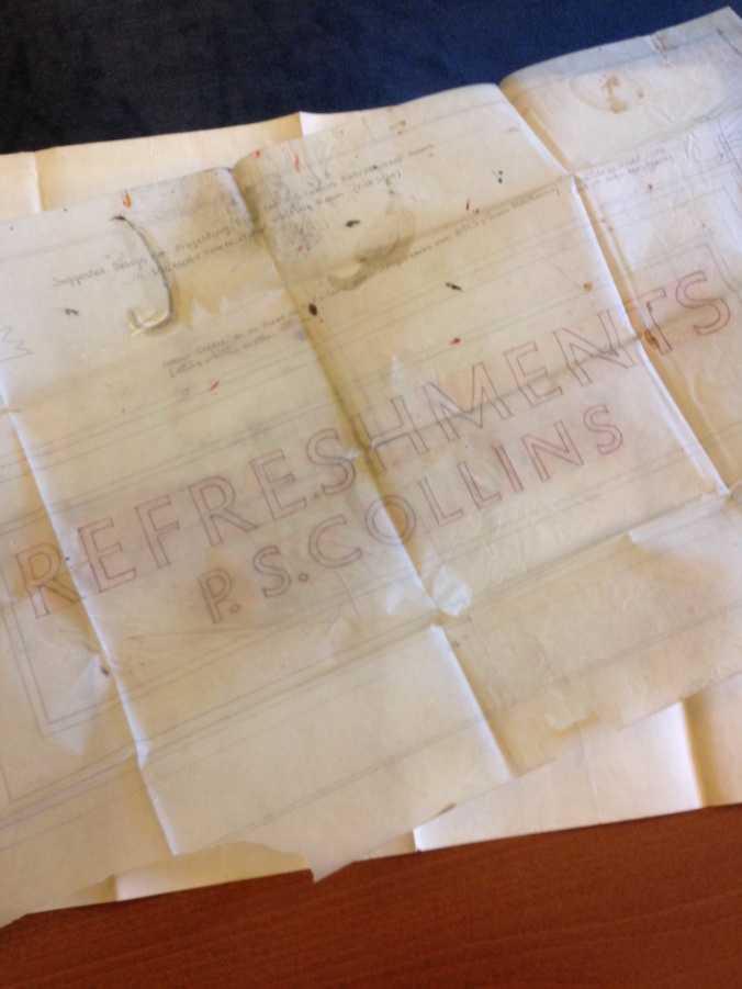
In 1931 an experimental type-face, designed by Percy Delf Smith, was tried out at the recently constructed Sudbury Town station on the Piccadilly line. The font used was a ‘petit serif’ designed by Smith and was applied to all of the signage within the station.
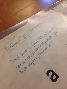
The typeface never caught on further down the Piccadilly line or, for that matter, any of the other lines. Percy Delf Smith’s papers, which are held at St Bride, show the minute differences between the two fonts. Petit serif survives in two places, one of which is MyFonts.com; the other is Sudbury Town tube station, and is worth a look if you’re ever in that part of London.


Pingback: Printers’ Portraits | St Bride Foundation