By Simon Loxley
I still have a copy of a programme from a St Bride Foundation Conference in 2009, which I kept partly because it was an amazing piece of paper engineering, that seemed to keep unfolding out of itself. It was handsomely printed in gold on an uncoated black board, but over the intervening years the ink has sunk into the surface, leaving the graphics as a barely perceptible ghost image. In a way this seemed quite fitting. I imagined future historians and experts poring over this object, trying to decipher its hieroglyphics and its purpose, an enigmatic survivor from a long-lost, not entirely imaginary graphic golden age when you could enjoy a whole day of design delights and imagination-fuel at St Bride Foundation.
There hasn’t been a conference since 2011, but 11 November 2023 saw the return of the format, titled Innovation. Inspiration. Imagination. Invention. After such a long gap, memory might have made its predecessors an impossible act to follow, but there was no need for concern, as this was a great lineup of speakers. Our gratitude and congratulations go out to host and chief organiser Becky Chilcott, who kicked off proceedings with an interview with French illustrator Jean Jullien, who has taken his playful, flat-colour figures and style into a variety of media, and around the world, using wildly varying scales – from flat planes in gallery spaces to curving around trees and leaning up against, and visually dominating, buildings. As one audience member commented, it was ‘lovely being inspired on a Saturday morning’. And there was much more of that to come.

Of course, as conferences progress you notice themes or connections between people’s work. Two of our speakers had taken ideas out into the wider community to help and inspire children and young people. For a while Dominic Wilcox worked with design group The Partners. In terms of a long-term design career, you might think, home and dry, but he walked away from it. ‘I never really worked out graphic design’, he said, but he liked the possibilities of playing with ideas, making unlikely and humorous or surreal connections between ideas and objects, then visually expressing them, often in a three-dimensional form. We saw fabric made from savoury snacks; tiny human dramas acted out on the face of a watch, animated and given possibilities by the revolutions of the second hand; ‘luxury’ skimming stones, encased in gold leaf and with their own carrying case, to be carried around until the perfect moment and setting presents itself, money and perhaps years spent for a couple of seconds with an unpredictable result; recording the sounds of people making things; art exhibitions for dogs.
These were just some of his ideas and creations that delighted our audience. Dominic took his world of imagination on the road, both for adults to imagine their own uses for bizarre and absurd ‘found’ objects, but also crucially to children, through his Little Inventors organisation and engaging with schools around the globe. It has even led him to speak at the United Nations. Life, not just design, benefits from making unlikely connections, seeing possibilities. ‘To be creative you have to be relaxed and open’, and creativity comes from self-confidence, Dominic told us.

In the Noughties, the American novelist Dave Eggers was instrumental in setting up a writing centre for children and young people in San Francisco. The premises found had a retail usage-only space at the front. Turning this to advantage, he and his colleagues conceived the idea of creating a ‘Pirates’ Shop’, where all the products on sale would be for that specific clientele. The entrance to the workshop space was a door at the back, so the children had a sense of entering a secret world just for them, via an imaginative portal. After setups elsewhere in the US, Eggers suggested the idea could be extended globally, and the International Alliance of Youth Writing Centers became a reality.
Alistair Hall of design studio We Made This was one of those inspired, and once the cause was taken up by novelist Nick Hornby, some funding began to come in, and the Ministry of Stories was set up in Hackney, offering creative writing and mentoring for local young people, mostly through weekend writing projects, an opportunity to realise creative potential and build confidence. For their shop, the Ministry settled on the theme of monsters, imagining a clientele of vampires, reanimated corpses, werewolves and gigantic apes, and thus began Hoxton Street Monster Supplies. There are no pictures of monsters in the shop – they exist only in your mind, as you browse the products they might want to buy. Neck bolt tighteners, bandage repair kits for mummies, tins of sweets labelled Tinned Fear, (The Collywobbles), Escalating Panic, A Vague Sense of Unease and Creeping Dread, working with authors to create the copy for the labels, such as Earl Grey Tea ‘made from real earls’. Humour is an essential: ‘Customers are politely requested to refrain from eating the staff’, ‘Beans (magic or otherwise) are not accepted as payment’, ‘Only one giant in the shop at a time’, we are told as we enter. The shop represents a physical walking into a story, a tangible manifestation of imagination at work. There is even an invisible cat, whose purring can be heard in the vicinity of his basket.
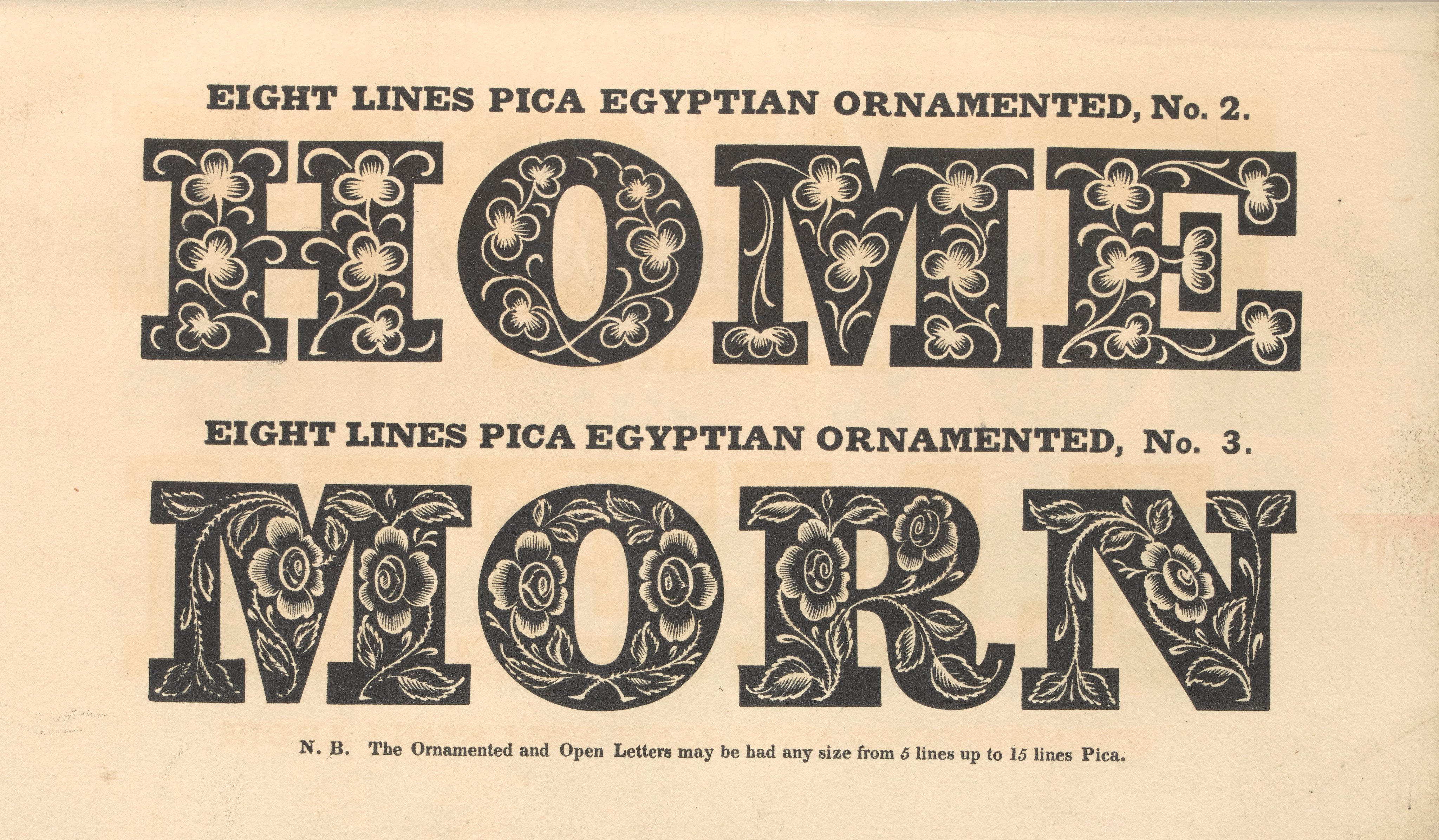
There isn’t a single corner of graphic design’s past and history from which some sort of inspiration can’t be extracted. Naomi Kent, senior technician at the printmaking department at Birmingham City University, found hers in late nineteenth century ‘artistic printing’ – often superbly printed, but stylistically an incredible melange of styles and decoration that seemed to have no guiding principles apart from complexity and a hoped-for visual luxuriance, and often resulting in a dizzying visual stew. However, Naomi’s particular area of interest is ‘non-linear typesetting’, so what better source of inspiration? She also drew upon the 1930s ‘type pictures’ created from ornaments by Albert Schiller. Naomi delights in metal type’s physicality. ‘I like maths,’ she says, and for her typesetting is ‘a little mathematical puzzle with a wonderfully satisfying solid structure of type’. She also showed us the ‘lockups’, the finished composition in its chase, ‘more beautiful than the outcome a lot of the time’. She used the University’s jewellery department’s equipment to find ways to bend metal rules to create curved lines, and creates her own pictures from type ornaments; despite being modest about her illustration skills, she has succeeded in making delightful, amusing and inventive images while working in a very difficult medium.
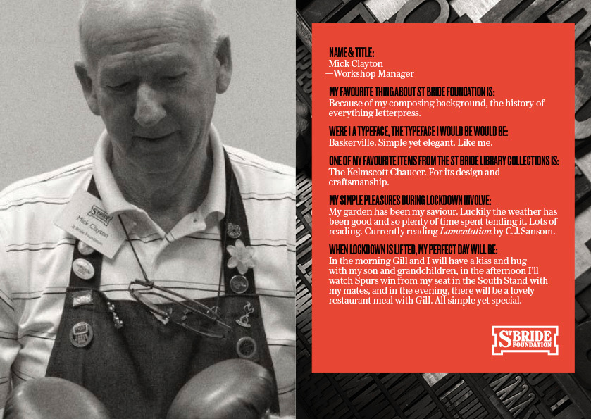
At lunchtime you could take a look at some of the Library’s treasures upstairs in the Passmore Edwards Room, but I found myself wandering below to the print room, partly, I had to admit, to see if Mick Clayton had the Premier League’s early kickoff running on his laptop. He did, and I also bought for a tenner a flong of the front page of the Financial Times from August 1986, lost print technology I’ve long wanted an example of.

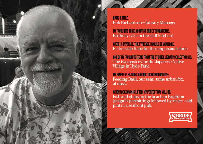
There was a 1951 film called The Magic Box, a patriotically-motivated Festival of Britain production which starred Robert Donat, he of Hitchcock’s The 39 Steps, as William Friese-Greene, presented as a lovely, sad-eyed old gentleman who had been tragically overlooked by the world as the inventor of cinema. This may or may not be the case, but the film certainly harboured no illusions about his disastrous finances. Few, if any, have delved deeper into the shadowy corners of the Library’s collection than long-time volunteer and assistant Bob Richardson, and he shed light on Friese-Greene’s further career, a long trail of bankruptcies and bitterly disappointed investors in the wake of his pursuit of inventions and innovations.
There was ‘inkless electrical printing’, which sounds as though it worked on a similar principle to the fax, putting an electrical charge through chemically treated paper. We were amazed to learn that, 124 years previously, Friese-Greene’s Electrical Inkless Printing Syndicate had given their first demonstration of the process in the very room where our conference was now taking place. It didn’t go well. St Bride was wired for alternating current, and the presses needed direct current. The special paper failed to turn up, and they had to make their own hastily on site. The results were unimpressive – and brown. Under the right conditions the process could produce fine results, but they also tended eventually to turn, you guessed it, brown. Losing interest in refining the process, Friese-Greene moved on to his ‘advertising hat’, where moving images could be projected from inside a top hat onto an attached screen. Bob also showed us some early typesetting systems, and pioneering reproductions of newspaper images, in particular the Daily Graphic from 1890, times when an illustrator might be sent to make a drawing of a newsworthy event, and his work expressed back to the office by carrier pigeon.
Like Dominic Wilcox, Sarah Boris also got some great in-house graphic design appointments, including working for Phaidon, but found that, for her, the gloss eventually came off. A large percentage of her working week, she realised, was spent in meetings. Seeking to alter this balance, she left to set up her own studio, and has gone on to produce a vast portfolio of work including three-dimensional public art commissions, stunning screen-printed posters and an artist’s book. Interestingly, thinking of that flong, and purportedly dead graphic techniques, she was also experimenting with making her own dry-transfers.
Book cover designers par excellence Jon Gray and Jamie Keenan teamed up to give us a very entertaining, but also highly instructive analysis of how to design a book cover. They had broken this down into nine tactical approaches, including ‘The Obfuscation Theory’, ‘The Unheimlich Conjecture’, ‘Type as Image’ and ‘The Ju Jitsu Supposition’. Easy! Well, of course, in addition you’ll need the pair’s restless visual eye, superb analysis of content and its implications, and their intelligence and humour. Jamie Keenan’s cover for Vladimir Nabokov’s Lolita, not a book anyone would probably fancy tackling these days, was nonetheless a startling and brilliant example of finding and using something ordinary and seemingly unconnected that, depending how you look at it, can become something less ordinary (this fell under ‘The Unheimlich Conjecture’, looking for ‘the strange’ and making it familiar, or vice-versa), and worked on three different levels. The cover for Alissa’s Nutting’s Tampa (Jon) was no less startling, and drew an exclamation from the people sitting in front of me. Chris Offutt’s My Father, the Pornographer, (Jamie), with its pile of books forming a human profile, and a favourite of mine, Jon’s cover for Jonathan Safran Foer’s Extremely Loud and Incredibly Close, were both examples of ‘Encapsulation’ – images doing more than one job. The presentation was a visual feast from both presenters, humorously and self-deprecatingly delivered.
If Dominic and Sarah had both elected to move away from larger, established structures to work on their own, our final speaker arguably took an opposite direction, from being essentially a solo ‘name’, to applying that name to a design consultancy with international reach and clients, currently including Coca-Cola. I’m old enough to have been fascinated and inspired, as it hit the newsagents’, by Neville Brody’s work for The Face magazine in the 1980s. I’ve subsequently made the assertion to students that he made typography sexy, and was a not-inconsiderable factor in why they were now doing what they were doing. He wasn’t the only one of course, but I’d stand by that statement. Had I been better educated, I’d have been able to appreciate more effectively at the time some of his influences; but you can overthink things, and sometimes it’s good just to take time, look and appreciate.

That sheer enjoyment of simple two-dimensional shapes and intersections still seemed, I thought, to be a presence in the recent and current work he showed us. I sensed a certain wistfulness while showing us a photo of the young Brody pasting down prints of his hand-drawn letters to create the artwork for Face headlines, and for those times – that greater technology hadn’t necessarily always given us more: ‘The technology has evolved incredibly, but what we can do with it has shrunk… it has become very generic … little windows we can perform in. But what print allowed us to do was experiment with the way you present the content and the information. So we’ve shifted from word, image and layout to now just word and image.’ It was a theme he’d return to later in the talk: ‘…how do we juxtapose images, how do we create stories out of adjacency? Adjacency has kind of disappeared in digital spaces’. Magazine layout allowed this to flourish (and, I’d add, a willingness to spend time looking) which is difficult if not sometimes impossible to maintain through the structures of online media. They certainly don’t encourage us to spend time.
Neville expressed his admiration for St Bride Foundation as a place with a focus on ‘the hand-built… everything is tactile’. Despite the responsibilities and demands of working for massive names, I got the impression that what excites him as a designer may have evolved, but remained in essence unchanged from those days when the bike messenger was standing impatiently to grab that piece of hastily finished artwork and be away. And I (and Mick) shared his pain at the result of that early Premier League kick-off.
Simon Loxley is a graphic designer and author of books and articles on design, typography and design history. He is the author of Emery Walker: Arts, Crafts and a World in Motion (2019), Type is Beautiful: The Story of Fifty Remarkable Fonts (2016), Printer’s Devil: The Life and Work of Frederic Warde (2013), and Type: The Secret History of Letters (2004). Simon designed the Emery Walker’s House logo and designed and edited Ultrabold, the journal of St Bride Library. He is also the author of A Geography of Horror: The Ghost Stories of M.R. James and the Suffolk Landscape (2021).


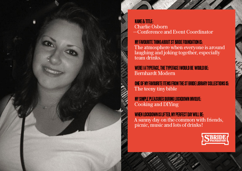 Charlie Osbourne – Conferences and Events Coordinator