An update on our digitisation project

We are nearing completion of the mammoth project of digitising our collection of pre-1830s type specimens. The collection consists of around 170 bound volumes, with single-sheet specimens kept aside for possible future digitisation work. We have made this treasured part of our collections freely available online, so they can be used by researchers the world over. The project has been funded by the generous donations gathered from our community through our 125th anniversary fundraiser in 2020.

Didot, Legrand et Cie. (1828). https://archive.org/details/16583

At the time of our last blog update the collection was being prepared for digitisation by conservators at the National Conservation Service, ensuring they were in a suitable condition to physically withstand the digitisation process and to produce good clear images. The specimens have since been transferred to the digitisation studio at the Postal Museum, where each individual page has been photographed and painstakingly organised into digital representations of the original volumes. The photography and file editing are now complete and we are finalising the process of checking the files for any problems, to ensure high quality throughout our digitised collection.

Image
Bower and Bacon (1830). https://archive.org/details/19233_202206

The physical specimen books are now back on our shelves at St Bride and the main bulk of the digital collection has been uploaded to the Internet Archive here, with a small number still to come. The Internet Archive collection features lower resolution PDFs, which can be accessed free of charge. For those requiring higher resolution files, we have 600ppi TIFF and JPEG files, that can be obtained subject to a £25 charge, or £20 for students and Friends of St Bride Library.

We can’t wait to see how you make use of this new digital typographical treasure trove!

Thank you to all our 125th anniversary supporters, who have made this project possible.

Cataloguing the Beatrice Warde papers

Rather aptly for Women’s History Month, we have recently been cataloguing the papers of Beatrice Warde, a pioneering woman in the world of print and typography, referred to by some as the ‘first lady of typography’.

Beatrice Warde (1900-1969) was born in New York, to parents May Lamberton Becker, a journalist and literary critic, and Gustave Becker, a composer and music teacher. The young Beatrice inherited a fascination with the printed word from her mother and showed an interest in both writing and letterforms during her education at Barnard College, Columbia University. Our collection of her papers includes short stories and poems written by Warde in her youth, demonstrating this early love of language.

Beatrice Warde first entered the professional typographic community in 1921, working for the Typographical Library and Museum of the American Type Founders Company. She soon moved to London to pursue her career, writing articles for trade publications and eventually taking on the role of Editor for The Monotype Recorder. By 1929, Warde was Head of Publicity for the Monotype Corporation and making a name for herself as an in-demand writer, researcher and speaker on all things typographic. 

Warde published much of her written work under the male pseudonym Paul Beaujon. Our collection includes tapes of a recorded 1959 interview, in which Warde explains the reasoning behind her male pseudonym:

“I wasn’t quite sure at that time (which is a long time ago) that women would be taken quite as respectfully. I thought that if I was going to have a pen name, I might as well have a man, and I took a Frenchman’s at that, to make it a little more mysterious.”

Warde was a governor of St Bride Foundation from April 1953 until her death in 1969, an active member of both the Governing Body and Libraries Committee. Very close to the hearts of our library team, Warde dedicated herself to fundraising for our library, heading up the Appeal Sub-Committee to oversee this and securing the future of the collections that we still care for today.

The Beatrice Warde papers held at St Bride include a vast collection of her writing, from childhood short stories to her famous essay The Crystal Goblet, with examples in both manuscript and published form. There are examples of her manifesto for printers, This is a Printing Office, in multiple languages and variations. Photographs of Warde mingling with the great and the good of the print world can be seen alongside correspondence and ephemera such as a family tree. The collection also encompasses a large amount of material relating to Warde’s work setting up the May Lamberton Becker Reading Room at the National Book League, cementing her mother’s legacy in promoting the printed word.

You can view our work-in-progress catalogue of the Beatrice Warde papers here. This project is part of a much wider programme of cataloguing our archives and special collections at St Bride Library. We have added specialist archive cataloguing software to our collections management system, so when searching our online catalogue you will now see separate tabs for ‘Printed Material’ and ‘Archives’. We have been surveying our collections and prioritising them for cataloguing based on their research value and relevance for our researchers. We are working to add many more of our special collections to the catalogue, making them more accessible to researchers and building a clearer understanding of the treasures we hold.

An update from St Bride Library

Thanks to the generosity of our community, we raised over £65,000 in our Crowdfunder campaign towards the end of 2020. We could not be more grateful for this support to help us celebrate 125 years of St Bride Library and secure the future of our collections. We pledged to use this funding towards:

  • Providing opportunities for young people to gain work experience in our Library, Archive and Print Workshop.
  • Developing new print and design workshops.
  • Curating and filming a physical and online talk series.
  • Curating physical and online exhibitions.
  • Creating an online digitised collection of our unique treasures, so our communities can access them whenever and wherever.
  • Continuing to conserve and catalogue our irreplaceable archives of print and typography.

Since then, the Library team have been busy working from home on kitchen tables and makeshift desks, getting plans in motion for some exciting projects. Bringing the spirit of St Bride to your homes, we have presented a series of remote talks curated by the excellent Becky Chilcott. A treasure trove of recorded talks can be found here.

Some recent online talks available on Vimeo

Behind the scenes, we have been carefully planning our pilot digitisation project. Informed by a survey of our library community, we have selected our pre-1830 type specimens as the first part of our collections to be digitised. Our type specimens form the backbone of our collections and are in high demand by researchers, so we are excited to be working to make them available to you online. These earliest examples will especially benefit from digitisation as some are fragile and susceptible to damage through regular handling – the availability of digital copies will reduce the need for physical handling.

A sample of how our digitised type specimens will look

Conservators – the magicians of the library world – from the National Conservation Service have begun the process of assessing the condition of the type specimens. Conservation treatment will ensure the collection is in sound condition so that clear images can be captured and the items can safely withstand the digitisation process. Volumes have been surface cleaned and any significant tears, loose bindings or detached boards will be repaired.

To make sure we create a digital collection that meets the specific needs of our audience of typographers and designers, we have thoroughly researched the technical specifications for this project. We have gathered advice from sector colleagues such as the Letterform Archive and the National Archives’ digital experts and have spoken to a number of digitisation studios. Once the conservators have worked their magic, we will be getting started with the process of digitising the collection, which you should see materialising online later this year.

Some of our pre-1830 type specimens awaiting digitisation

Now that we are back in our building, able to once more inhale the particular ‘old books’ odour of Room 19 and physically handle our beloved collections, we are preparing to begin a cataloguing programme. As the first step of this we have procured an archives-specific collections management software to work alongside our existing library catalogue and are beginning to prioritise collections for cataloguing. Cataloguing our archives and special collections will make them easily discoverable for researchers using our online catalogue, as well as improving our own knowledge of and ability to manage these unique collections.

We have been keeping busy delivering on our 125th anniversary ambitions, despite the challenges of working remotely for much of this year (namely a cat with a penchant for sleeping on laptops). We are excited to share more of the outcomes of this work with you later in the year and will keep you all updated on our progress. In the meantime, our reading room and workshop are bouncing back to life, so do pay us a visit!

Mr. Baker’s rubber alphabet

The Story of Britain’s Most-Popular Printing Toy

Nineteen-twenty-two was a good year for budding printers. In the leafy London suburb of Twickenham a young man called Donald Aspinall set up the Adana printing machine company, while a short distance to the east, in the City of London, three businessmen were laying the foundations of an equally famous printing-related company. The name of their small enterprise—The Charter Stamp Company—means very little today, but their most famous product—the John Bull Printing Outfitis probably more fondly remembered than the Adana press.

John Bull Printing Sets are among Britain’s oldest and most popular toys and the most common childhood introduction to ‘relief printing’. The toy was looked upon as the perfect ‘stocking filler’ by generations of doting parents and grandparents. Cheap and simple to use, they provided hours of fun for little fingers and a much more typographically creative form of wallpaper gratffiti than crayons alone could ever do.

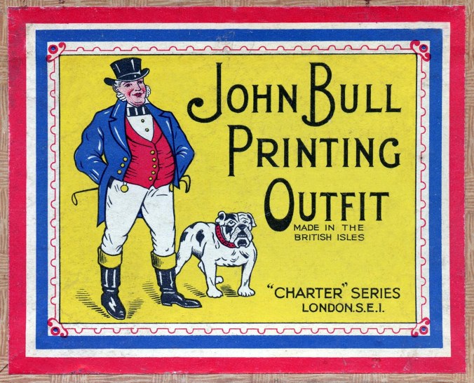
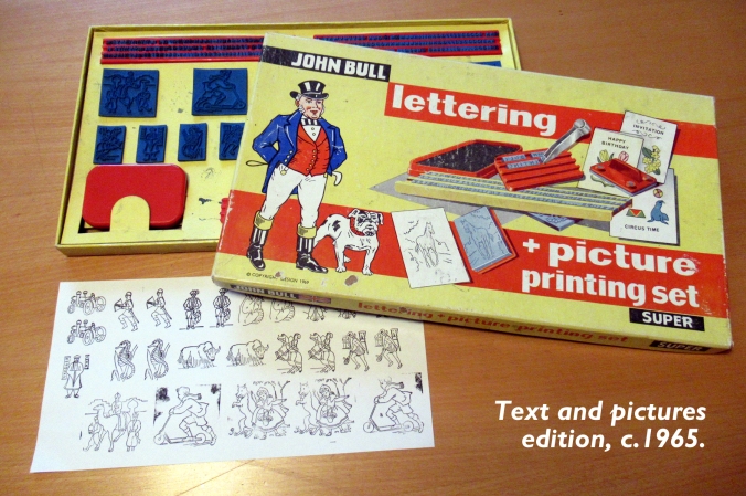
St Bride Library has a small number of John Bull outfits. Acquired over the past century or so they are not catalogued, but form part of our Special Collections. The manufacturer’s name varies according to the age of each set and boxes sometimes carry “Charter Series”, “Carson-Baker” or “Carbak” names and logos, depending upon when they were made.

Charter Series: The Zoo Printing Set

The Carbak Picture Printing Outfit

In 1922 rubber stamp maker John William Baker of Sydenham, Harold Christie, a toy dealer from Staines, and bulb-grower Thomas Baker of Spalding, established the Charter Stamp Company with capital of £3,000 divided into £1 shares. This was a very healthy sum indeed for 1922, equivalent to around £175,000 today.

There is documentary evidence that Charter Stamp had traded for a number of years before the creation of the 1922 company. A number of late Victorian and Edwardian rubber stamping sets for children also carry the “Charter” trade mark. A 1916 sales receipt from a Wandsworth stationer also clearly refers to a John Bull Printing Set, eleven years before the trade mark was registered with the Department of Trade.

The incorporation paperwork for the company is dated 23rd March 1922 and states that the company was founded “to carry on business as manufacturers and dealers in stamps and dies, toys, stationers’ sundries…and articles of any description”. The directors set up their head office at 57 Old Street in the City of London and spent the next five years selling stationery and making rubber stamps for office use. The manufacture of rubber stamping toys for children was carried on alongside these commercial activities.

Five years after the foundation of the Charter Stamp Company, in February 1927 the John Bull trademark was formally registered with the submission of artwork which would be used in packaging design for the next five decades. The original watercolour of John Bull and his dog survives in the National Archives at Kew. The distinctive box design became so recognisable that in January 2009 The Guardian political cartoonist Martin Rowson showed the Chancellor of the Exchequer trying to re-start the UK economy after the global financial crash with a John Bull Quantatative Easing Kit. The iconic box design was parodied in the newspaper cartoon, which can be viewed here.

Early John Bull sets consisted of just upper-case characters, around 12 point in size. Rubber illustration blocks would be introduced into the sets by the late 1920s, but had also been sold separately under the “Charter” name for three decades or more. Early sets sometimes included a rubber stamp showing the John Bull figure illustrated on the box lid. By the early 1930s a slab-serif typeface with upper and lower-case characters had been introduced and more expensive sets included printing blocks showing a clown, juggler, and Native American Chief and farm or zoo animals.

Endless versions of the rubber stamping sets were issued from the company works in South Norwood. Sets were numbered anywhere from “1” to “250”. There were also “Special” sets which were sometimes indistinguishable from the basic kits. The smallest set was marginally larger than a box of kitchen matches while the largest dwarfed a standard Monopoly board game box. The most commonly seen survivors are sets No. 4, 8, 18 and 12.

Perhaps the strangest John Bull product is that which uses Monotype. These sets, with Monotype metal types, appeared soon after the WW2 and British patents dated October 1946 cover the special typeholder required (Patent 617,495) and the custom-designed cardboard typecase (619,092). The set contained 120 pieces of 12pt Monotype Gill Sans, although, rather curiously, the accompanying instruction leaflet was set almost entirely in Stephenson Blake’s rival sanserif, Granby. A special wooden typeholder accommodated two lines of type, held in place with a thin wooden wedge. Only en-spaces were provided for use between words. A foam-rubber ink pad with non-toxic, water-based ink was supplied, so the results cannot have been very satisfactory. By 1950 this metal variant had been discontinued.

John Bull Metal Type Printing Outfit using Monotype Gill Sans

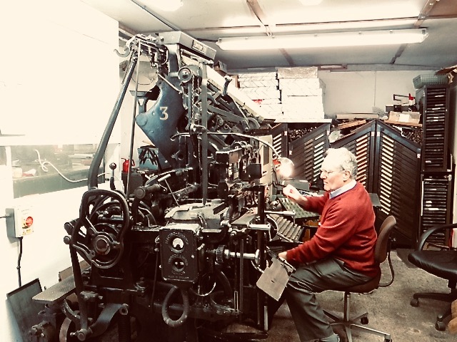
The Charter Stamp Company moved head office several times in the early years of trading, but would eventually settle at 57 Southwark Street, London SE1, where the sets were also produced. The company proclaimed the John Bull Printing Set to be 100% British made. This was true. Boxes were made on site, the rubber letters were moulded and vulcanised at the factory and even the non-toxic water-based ink was brewed up in large buckets. The product range expanded and by the early 1960s included a small rotary hand press (Model No. 5) which could accommodate several line of rubber type in a grooved drum, rather like the American Multigraph printing machine.

On 25th May 1946 a meeting was convened to discuss a possible change of name for the company. The maiden name of founder John Baker’s mother was Carr, and he was therefore “Carr’s son”. Baker was of the opinion that double-surname companies carried more commercial clout. There was a famous precedent for this, with tea importer and blender Arthur Brooke inventing a non-existent business partner—Mr. Bond—in 1869. On 11th July 1946, the Charter Stamp Company became Carson-Baker Limited and the “Charter” trademark became “Carbak”. “Charter Series” packaging materials were still being used in the 1950s until the stockpile of old box designs was gradually exhausted, so the two trademarks often appeared side-by-side

In the late 1970s costly plastic injection-moulding equipment was purchased for soft polymers, although the old vulcanised rubber system was retained for foreign language sets. The export market was important as a source of income, but the cost of producing new moulds for foreign territories was prohibitive. In the 1970s between 60,000 and 100,000  John Bull Printing Outfits were being made each year.

Surplus manufacturing capacity allowed the production of components for another maker of educational rubber stamps. The Mapograph Company of Chiswick produced a roller printing system which allowed images to be applied to the pages of school exercise books. Maps, biology diagrams, trees of Britain and technical illustrations made up a substantial library of stock images for scholastic use. Invented in 1924 by Alfred Kings and Bernard Simons, the Mapograph system used a deep relief rubber stamp on a wooden roller. A spring-loaded mechanism re-set the roller, giving a perfect print (theoretically) on each page. Mapograph inks and stamp pads were made by Carson-Baker. When the elderly owner of Mapograph retired in 1978, the company became a wholly-owned subsidiary of Carson-Baker.

Toy manufacturer Cowan DeGroot were the largest distributor of John Bull sets and when John Baker retired in the 1960s, Carson-Baker was acquired by their main customer. The “Codeg” trademark replaced “Carbak” on packaging and advertising material. Following the takeover, Cowan DeGroot expanded the range of products. By 1970 children could buy a John Bull farmyard set, backgammon, draughts and even a board game version of the BBC Mastermind quiz show. Frustratingly for Codeg, this had to be called Masterbrain because a rival board game made by Invicta plastics and unconnected with the BBC series, already used the name Mastermind. Nevertheless, the packaging for Masterbrain proudly stated that it was “brought to you by the makers of the famous printing outfits”.

Cowan DeGroot sold the John Bull trademark to Dekkertoys of Peterborough in the late 1980s, but the famous printing sets are no longer available. Second-hand sets occasionally appear on Ebay but new printing outfits are no longer manufactured.

My passion for letterpress and typography was sparked by the gift of a John Bull set at the age of five. Sadly, with the demise of John Bull printing sets, young letterpress printers today must seek their inspiration elsewhere.

Bob Richardson

Library Manager

St Bride Foundation

St Bride Staff & Volunteers interviews


St Bride Foundation is run by a small family of staff and volunteers. During lockdown we took the opportunity to ask everyone a few short questions so you can get to know us a little better. Click on the names of each member of staff for a PDF of each interview for an easier read, especially for those of us who didn’t use the less is more approach for our answers …

St Bride biographies AliAlison Lee – Foundation Manager

St Bride biographies SteveSteve Linehan -Workshop Volunteer

St Bride biographies NuritNurit Karol – Accounts Assistant

St Bride biographies MaryMary Machiraju – Library Volunteer

St Bride biographies AndrewAndrew Long – Workshop Apprentice

St Bride biographies CharlieCharlie Osbourne – Conferences and Events Coordinator

St Bride biographies MickMick Clayton – Workshop Manager

St Bride biographies SophieSophie Hawkey-Edwards – Foundation Librarian

St Bride biographies BobBob Richardson – Library Manager

St Bride biographies BarryBarry Felstead – Workshop Volunteer

St Bride biographies AngieAngie Brignell – Conservation Volunteer

St Bride biographies Philip-1Philip Mould – Finance Officer

St Bride biographies Becky-1Becky Chilcott – Events Curator

St Bride biographies Joe.jpegJoe Rosser – Facilites Manager


Sue Shaw obituary

WhatsApp Image 2020-07-02 at 11.03.10

Here at St Bride Foundation we are very sad to share the news of the death of Sue Shaw.

Letterpress printing was in danger of disappearing in the 1990s, but Susan Shaw, who has died aged 87, determined to rescue it. After a career in publishing during which she learned the art of typographic design, she heard that the once great Monotype Corporation was in danger of bankruptcy. In 1992, with funding from the infant National Heritage Memorial Fund, and backed by her own astounding energy, she organised the transport from Redhill to Stockwell of all that could be saved, from the crucial equipment to the equally vital documents. In Stockwell, Sue was able to buy out the occupants of an old industrial mews and install her new treasures, inaugurating what became the Type Museum. Not content with this, in 1996 she managed to persuade the owners of Stephenson Blake of Sheffield, the last surviving makers of metal type for hand-composition, to sell their plant going back to the sixteenth century; this time the Heritage Lottery Fund provided finances. In the same year, she was able to add the equipment of Robert De Little, the last makers of wood-letter, used for printing play-bills and posters. Some of the original work-force came too, but there were never enough hands to keep all the equipment working at once, so she changed the name from Type Museum to Type Archive. There it remains, the repository of printing history in Britain over five centuries, and a memorial to Susan Shaw, who devoted her life to preserving it. Her last triumph was to see the name of the street where it is changed to ‘Alphabet Mews’.

Nicolas Barker

From the St Bride Archives: Hats off to George!

We had a visitor to St Bride Library a few weeks before its temporary closure due to the Corona Virus pandemic. She was trying to find out a little more about an ancestor in the printing trade who was described in the 1901 census as a ‘Hat-Tip Stamper’. Did we have any information about this obscure trade? A search through the general catalogue found nothing, but tucked away in our Special Collections file was a reference to George Fowler, Hat-Tip Stamper of Bermondsey, south-east London. A research session in Room 19, our main book stack, quickly located a small box of ephemera relating to George Fowler’s business activities.

The Special Collections at St Bride number 200 or more and include a vast range of materials related to printing and publishing. Here you will find 1,051 boxes of original steel punches from the Caslon Foundry and the original flongs (moulds) for Harold Curwen’s Puffin Picture Book No. 70 on the subject of “Printing”, together with trade union banners, scandalous broadsides, dozens of original woodcuts by Robert Gibbings, and others used in the works of Henry Mayhew. There are also many boxes of curiosities, including a handful of items from London’s last Hat-Tip Stamper.

Every piece of top quality headgear for a gentleman has a circular, square or diamond-shaped piece of satin sewn into the crown. This is often covered by a thin piece of celluloid to protect the satin ‘tip’ from Brylcreem or pomade, for a hat-tip is the small panel which carries the maker’s name and sometimes the size of the hat. George Fowler was Britain’s last hat-tip stamper. Each piece of satin went through George’s engraving press and all were carefully printed by hand. There was no mass-production of these satin tips.

George Fowler was a skilled engraver and made his own intaglio plates for producing the ‘tips’. At St Bride we have a small box of artefacts left behind when his business eventually ceased trading. We have not been able to ascertain the date of closure, but we do know from genealogy records and census returns that hat-tip stamping was recorded as a trade as early as 1830, half a century before George was born.

By the end of 1950 only George Fowler remained at this unusual trade in the UK. From a business which had once employed many hundreds of workers it had shrunk to a one-man operation, based in a first-floor warehouse workshop in Bermondsey. George’s work is often exquisitely detailed, which is all the more remarkable for something which rarely saw the light of day. The detail in some of his engravings is as fine as any woodcut by Thomas Bewick and his printing skills were second to none. A number of his ‘tips’ survive at St Bride in a small album, together with a handful of sketches of work in progress, rough ideas and envelopes filled with finished artwork.


The blank ‘tips’ were normally supplied by the hatters. Bundles of pre-cut silk or satin pieces would arrive at George Fowler’s works and he would complete the orders as required. Some examples we have are 2-up, reducing the printing speed by half. Perhaps he also printed 4-up, although this would have incurred considerably more initial expense, as additional plates had to be engraved by hand, but this might have been advantageous for larger orders. The surviving records are fragmentary, so it isn’t possible to tell how he approached each job. The tip designs we have at St Bride include all of the top names in hat-making; Harrods, Gieves, Dunn & Company and many others, including a special design for Panama hats.

The limited speed of production meant that George Fowler could never have supplied vast quantities of his work to High Street department stores. His product was very much for the upper-class hatters of Britain. His finest work appeared inside silk toppers, hand-sewn Harris tweed fishing hats and the bowlers worn by city gents. The quality of George’s work made it expensive and it probably cost more to print some of the better quality hat-tips than it does to manufacture a cheap baseball cap in the far-East today.

Apart from fragmentary business records, the only recorded description of George’s work appears in a cartoon strip drawn by Peter Jackson for the London Evening News in September 1950. George kept this short illustrated article and filed it away with his company records. The original newspaper clipping was very faded and creased but a little time spent with Adobe Photoshop has restored it to original condition and Jackson’s drawing of George at the press is reproduced in this blog entry so readers can get some idea of what he looked like and see the kind of press he used. The curious ‘swan-neck’ arrangement atop the press contains a small pulley, connected to a counterweight, which lifts the engraving blanket each time the star wheel is turned to open the press.

We have no idea exactly when George Fowler retired, but it was probably in the late 1950s or early 1960s. His name does not appear in trade directories during the first half of the twentieth century. As the only remaining professional hat-tip stamper in 1950 he probably had little need to advertise as there was no competition for this specialised work, which was already in steep decline. The cartoon strip shows a man who was probably in his sixties, which ties in with a birth record for Bethnal Green dated 1885, when a George Fowler was born to Henry and Emily Fowler of Bermondsey. This is speculation of course, but George was born at a time when few people moved far away from their birthplace, so there’s a strong possibility that this is our man. An internet search reveals nothing of his life after 1950. There is no bankruptcy record on file in The London Gazette, so perhaps the business was simply wound up.

Did George continue beyond his retirement age, or did the work fizzle out completely as cheaper, faster printing methods were developed? We have nothing at St Bride which answers these questions, but if the genealogical researcher who made the original enquiry at the library comes up with any additional facts we will add them to the Fowler material at St Bride. We would like to know a little more about this unique printer who was probably the very last of his line.

The Last Roar of the Linotype

6BC9CAAB-40C9-4853-BBAA-72A875B79D99

The Linotype Bulletin 1914. Image by kind permission of the Museum of Printing, Haverhill, MA

John Southward, writing in 1892, stated that printing is preeminently a progressive art. By 1897 he was eulogising the Linotype “this beautiful machine” and quoting Mr Gladstone: “It is a machine from which I cannot but anticipate effects equally extensive and beneficent to mankind.”

Not everyone was so delighted, even though, on its appearance in 1885, Edison called it “the eighth wonder of the world.” The compositors in both newspapers and printing offices viewed its arrival with alarm and a degree of cynicism. For many years inventors had been struggling with mechanical composition; a process documented by Southward, surely an engineer at heart, and publicised in his lectures. There had been some partial successes but competing inventions had cost careers and fortunes including that of Mark Twain. The arrival and success of Monotype in London a little later was to change the dynamics again.

339DC062-BAB8-4734-87E6-FC26297A40F2

Clip from Southward’s ‘Progress in Printing and the Graphic Arts during the Victorian Era’ 1897

Some of the early reviews were harsh. The Printers’ Register in 1889 described a circular as “simply execrable.” They continue, “The Linotype principle is ingenious, undoubtedly, and there may be something in it. But the invention has not yet been brought to the stage of ordinarily respectable work. It would almost ruin a journal to print it in this style.” After a lengthy discussion at the Royal Society of Arts about the ease or ability to correct a whole line slug, one speaker thought that at least it looked better than the text produced by typewriters.

The compositors who prided themselves on their skills and speed clearly disliked the promotion of something claiming not only to cut times and costs and, which, worse, might be operated by untrained boys and women! Not unreasonably they feared for their jobs and status and their setting speed competitions were under threat. There were attacks on the Linotype on mechanical, economical and sanitary grounds and then there was Linotype Billy. This circular is preserved in a box at the library and claims to be by Hugh Khan Avem. To be sung to the tune of the Longshoreman here is some of it:

I’m Linotype Billy, of London Town, and a “swank” operator I be;

I kid all the jossers when they come down the Linotype mangle to see;

I wink the off eye when a mug I espy, and – I’m known as the Linotype Liar –

The tales that I tell to each wondering swell makes them think

   I’m a marvellous flyer-a flyer-a flyer….

…My yarns of the speed that I show when I try, they “take in” as a matter of course

For while in America wasn’t it I with Mergenthaler held friendly discourse.

And “Mergy” he’d often say “Billy my boy, you‘ve a glorious future before you.

If you only can get on the Lino machine; but ne’er tell the truth I implore you…

The price was one penny each with the proceeds to go to the Caxton Convalescent home.

The effects on working practices weren’t always popular either. John Dawson, the editor of the Railway Herald, resigned, “For if I had stayed near a Linotype machine I should not now be alive. I have actually had nightmares with Linotype machines sitting on my chest… I hope if I ever have to meet it again it will have vastly improved both in its behaviour and its capacity of squirting hot metal at the operators is not what we should expect from a well-bred machine… Typographical appearance! Bless you that didn’t matter if only the promoters could say that a Linotype operator had set so many ems or ens in a day.”

It has always been said that the mechanisms are fiendishly complicated to maintain but the advertising to owners and employees was direct and plain. This at a time when printers still enjoyed quite flowery displays even for heavy equipment. Disputes over patents, shares and profits in the United Kingdom did not stop a ruthless campaign. It was even claimed after the purchase of many patents that a senior manager said, “if we cannot get the man to abstain from shooting then we buy the gun.”

Southward, having been a proponent from the first, was involved to the extent of advising on the typefaces which were most generally used in bookwork. On his death the Linotype Company UK contributed  to the fund to purchase his collection to support his widow. Thanks in part to this, St Bride Library conserves the Linotype footprint and the records demonstrating the changes it made to the organisation of printing establishments

IMG_6798 (1)

Typical turn of the century Linotype advertisement from the Caxton Magazine Vol 1-2

Despite their media success the company continued to draw attention to the flexibility of the machine and its decorative abilities to the trade. A souvenir volume The Calendar 1523-1923 uses their recent Benedictine typeface to display the calendar of the year with interesting dates from printing history. For example in May they pick out the birth of Ottmar Mergenthaler in 1854 and that it was in 1892 that the first Linotype machine was made in England. 

So where are they now? There are very few left in the United Kingdom even standing unused in museums. A fully working 1950s model was demonstrated to me at Amberley Museum. It was stunning to think that the weight, heat and surprising tinkling sound of these machines was once at the core of Fleet Street and an essential part of many printing houses. In the USA there has been a considerable effort to secure the heritage: a book by Frank Romano, the Linotype film and the work of the Museum of Printing, MA to pick just a few. Despite the number of enthusiasts across the internet they too are appealing for support in these difficult times. On both sides of the Atlantic this was a machine in constant state of change and improvement up to the 1960s and was a major force in the development of new media. Although the Linotype is to a great extent extinct, its influence should still be counted.

Linotype Amberley

Linotype still at work. Image by kind permission of the Amberley Museum.

By Ursula Jeffries, Library Volunteer.

Ursula Headshot

Ursula is from a Fleet Street family. On graduation she became a copywriter which led to work for organisations as diverse as IBM and the Citizens Advice Bureau. St Bride Library embodies her interests in London, communication, print and design.


Chaos type

IMG_6306
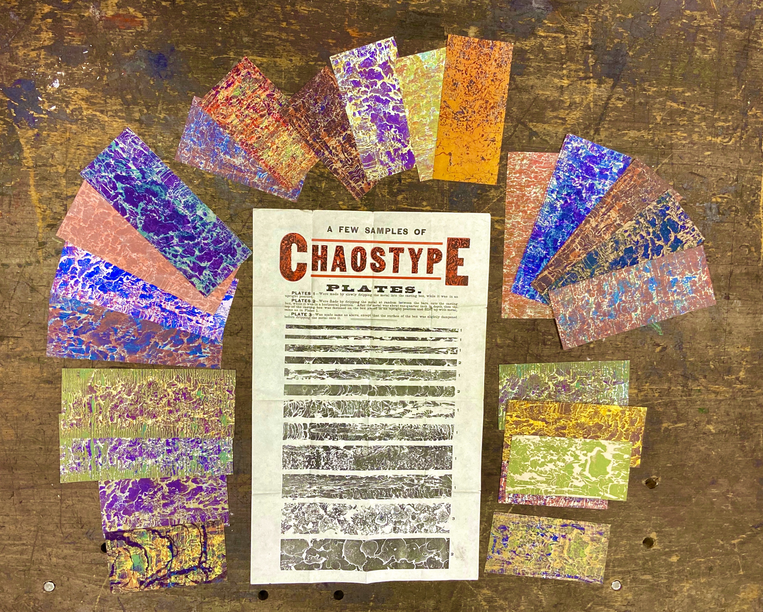
Chaostype was a method of producing and printing complex ‘organic’ images from the raw material of letterpress itself – molten type metal. John Franklin Earhart was the inventor of this process used for a short period in the late 19th century which relied upon the unpredictable and random qualities of chaos.  

Earlier this year the St Bride Foundation workshop gang decided to revive the process, one that hasn’t been used for well over a century. In this first video Library Manager, Bob Richardson, introduces the process.

The printing plates were produced by several different methods. At the heart of Earhart’s system was molten type metal, which was carefully poured into a casting box (used for making stereo plates) without a mould in place. The liquid metal could be tipped in horizontally or vertically, depending on the effects required. Dampening the base of the casting box, or even trickling a little water into the void before the metal was poured could create spectacular effects as the liquid vaporised and the steam created bubbles within the rapidly cooling typemetal alloy. Swirls, loops, crystalline starbursts and random meandering rivulets appeared within the surface of the Chaostype plate, which could then be removed and cut into strip material, mounted and made ready for printing.

A rather plain looking plate could be transformed by printing it over a solid colour in black and shifting the plate slightly (or moving the gauge pins on the platen) to create a tiny shift in position. Overprinting this image with gold or silver ink could create startling effects. The results were limited only by the imagination of the printer. Some chaos type printing has the same luminous effect of landscape painting, and other examples appear to be three-dimensional.

In this second video we see the workshop team experimenting to create the first pieces of Chaos type that have been made since Victorian times.

The process also served as a simple method of security printing as a plate, thanks to the complex random designs, were almost impossible to duplicate. A number of tickets and certificates survive which incorporate Chaos type printing as a security measure. Chaos type is now largely forgotten. Few realise the impact it made when it first appeared, but the results remain for us to inspect at leisure.

Many thanks to Steve Linehan, Barry Felstead, Bob Richardson, Mick Clayton and Andrew Long for their research, technical expertise, time and good humour – essential ingredients for mad scientists.

Typeface tales: time-travelling types

Frederic Goudy’s Village No. 2 typeface is travelling through time towards the year 6939 – and there isn’t a Tardis in sight.

Fleet Street abandoned hot-metal printing over 35 years ago for ‘new’ technology which already looks outdated. Offset lithography is rapidly being overtaken by digital printing processes which are particularly suited to short print runs which might be prohibitively expensive using older technologies.

Imagine then a time capsule, assembled in 1939 to be opened by our descendants in 5,000 years from now. What might our great grandparents have included to represent the cutting edge of printing technology at the outbreak of World War II?

Capsule Burial Site

The American Westinghouse Company prepared two time capsules—in 1939 and 1964, both for the World’s Fair in New York. Each was intended to contain a cross-section of material which represented our civilisation at that point in time, so the mix of items was an eclectic one. Printing and publishing were represented in many of the five designated object categories. The 1939 capsule was divided into the following sections: (1) Small articles of Common Use; (2) Textiles and Materials; (3) Miscellaneous Items; (4) An Essay in Microfilm, and (5) Newsreel. 

The materials used in the construction of the 1939 capsule were revolutionary and included a specially-made copper alloy (Cupaloy) which will not rust. The container was also flooded with nitrogen gas before being sealed in an attempt to halt any natural decay of the contents. Volatile materials were sealed in leakproof glass receptacles. The term ‘time capsule’ is said to have been coined especially for the 1939 Westinghouse project.

In Section One our English alphabet was represented by a set of 26 colourful blocks which were part of a collection of toys designed for the children of 1939. Section Two contained four different kinds of high-quality rag paper, used in the production of books, currency notes and permanent ledgers. Section Three is perhaps the most interesting; in addition to a copy of the Holy Bible, printed on rag paper for durability, there was also a fount of 14pt Goudy Village No. 2 printing type (upper and lower case). An 8pt Linotype slug, 13 ems wide, set in the Caslon typeface and a further slug set in the composing room of The Tuckahoe Record (New York) which reads “This Type set by Machine”, were packed with the letterpress artefacts.

Section Four of the capsule was a collection of microfilmed books consisting of some ten million words. Titles included The Lord’s Prayer in 300 Languages (also held at St Bride), copies of every major newspaper and magazine including Scientific American, Vogue, Good Housekeeping, Weird Tales and the Readers’ Digest. In the same section were Methods of  Printing by G Leonard Gold, Design and Beauty in Printing by type designer Fred Goudy, A History of the Printed Book by Lawrence C Wroth and Color In Use by the International Printing Ink Corporation.

Large numbers of airline, railway and bus timetables were also included, perhaps to illustrate the inter-connectivity of American cities and continents, but also, by default, to show examples of the kind of high volume work produced on a daily basis by large US printing companies.

Goudy Village No. 2 Character Set

Goudy Village No. 2 Character Set

Fred Goudy was particularly proud of the inclusion of his Goudy Village No. 2 types and made reference to the 1939 time capsule in a book he wrote in 1946 (A Half Century of Type Design and Typography) for The Typophiles. The typeface was one of his personal favourites and was cut in 1932 to replace Goudy Village (1903). The latter has a curious history. It was originally designed in 1903 for the menswear manufacturer Kuppenheimer as a special commission. Based upon the letterforms of Nicolas Jenson (1420-1480) there were similarities with William Morris’s Golden Type. The finished artwork was approved by Mr. Weinstock, the advertising manager for Kuppenheimer but the company accountant baulked at Goudy’s fee, which was certainly not excessive. The typeface was rejected on grounds of cost and Goudy received a nominal sum to cover his expenses. The drawings were returned to the designer.

Fred Goudy c.1925

Fred Goudy c.1925

Fred Goudy adopted the rejected Kuppenheimer designs as the house face of his Village Press but the type was completely destroyed in a disastrous fire in 1908 which also wiped out most of Goudy’s personal archive. The superintendent of the building where Goudy had his studio and print shop saw the original Village type matrices lying around during a casual visit one day and remarked that they must be valuable. He offered to place them in the building’s fireproof safe and Goudy agreed. It was a sheer fluke that the matrices survived when everything else was destroyed, although Goudy later sold them to art collector Frederick Fairchild Sherman, who used the face for his monumental Catalog of Dutch Paintings for the Metropolitan Museum. Goudy was well-rewarded by Sherman, who paid $1,142 (around £30,000 today) for exclusive rights to the use of the face, together with the matrices, 899lbs of 16pt type and 63lbs of the 22pt version.

Goudy Village (Original design)

Goudy Village (Original design)

Goudy later regretted the sale of the matrices and set about reconstructing the face as Goudy Village No. 2 (1932). The process was not without its problems. Village No. 2 could not be a straight copy of the original–that was not permitted under the transfer deed agreed with Frederick Sherman. Fred Goudy incorporated a number of improvements to make the face ‘as free from flamboyant features as possible’. Monotype representatives saw the new design and approached Goudy to purchase reproduction rights. Matrices for Monotype machines were cut in 14 and 18pt but an acrimonious dispute over ‘certain details’ (according to Goudy) meant that no further sizes could be made.

In addition to being physically represented by a fount of metal type, Goudy Village No. 2 was also used in the book about the Westinghouse Time Capsule which was included in the collection of material buried in 1939.

Our oldest identifiable typefaces are those cut for Gutenberg and Caxton around 550 years ago. In  the year 6939 our descendants—if the human race survives that long—will be excavating a letterpress typeface older than the tombs of the ancient Egyptian pharaohs. 

When they eventually open the Westinghouse Time Capsule, I wonder what will they make of Goudy Village No. 2?Set in Goudy Village (1903)

By Bob Richardson

Library Manager, St Bride Foundation