Are you comfortable?

Do you ever find that a long day of hitting the keyboard gives you painful wrists and fingers? Think what it would be like if you had to type on a typewriter and not your snazzy laptop. In the 1920s this was a real issue for many office workers, so one clever individual designed the ‘Komfort Keys’ – spring-loaded buttons that relieved the weariness of a hard day of typing.

IMG_1731

We found a few examples of these among the menagerie of wonderful curios in Room 19 here at St Bride Foundation. It’s just a shame that these absolute gems are not Mac compatible…

IMG_1733

The Procession of Animals

Free tickets to events are usually a treat, so it is no surprise that these 18th and 19th century prints were snapped up, purchased on the cheap and were considered the historical equivalent of a VIP Beyoncé ticket. Unfortunately for any happy punters that paid for these tickets, all they bought was a piece of paper and a lie on 1st April. There were, however, a couple of smaller giveaways on the tickets, so we shouldn’t feel too sorry for anyone who might have been conned by this trick.

IMG_1713

‘The Procession of Animals’, to be fair, does sound like a fun day out – after all, seeing the penguins at the Zoo is not one to turn down. This ticket wasn’t noticeably outrageous, apart from the secretary’s name – ‘J C Wildboar’ – who could very easily been someone destined to work with animals.

IMG_1714

Our second ticket of non-legitimate origins is one that allows the holder entry to Crystal Palace and the gardens. Another nice day out, in the grand scheme of things – shame it was another scam. The main clue on this piece is the name of the secretary – ‘A. Nidiot’ – a fairly obvious giveaway. For any eagle-eyed detectives out there, entrance to the palace is through the ‘Egress Gate’; I don’t think entering through the exit would be particularly easy.

IMG_1711

Ticket number three, if real, would have granted you passage on a boat trip to the Nore sand bank and back. Sounds like a peaceful day out, but this is another obvious trick. The captain, ‘Samuel Asinus’ [Latin for ‘Ass’], probably wasn’t capable of sailing a rubber dingy; as the steamer itself, if you believed that it existed, you might have been more than a little bit gullible.

IMG_1710

Over the Moon with his discovery

Dr William Moon was born with a sense of sight; however, at an early age he lost the ability to see out of one eye and, by 21, was completely blind.

IMG_1720

Determined not to let this faze him, Moon began to teach blind children how to read using existing embossed reading codes. None of the systems Moon used or taught were particularly user-friendly, so he set about creating a simple system that anyone would easily be able to pick up: Moon type, which was based on a simplified form of the Latin alphabet.

While Moon devised the type in 1843, it wasn’t until 1845 that it was published. These typefaces would have been printed in a different way to your standard letterpress print. Instead of the type being loaded into the press backwards and printed onto the front of the sheet, the type for Moon would be arranged in reading order, and printed onto the back, to create a negative. Soft paper was put behind the substrate to allow the pattern to be embossed.

IMG_1718

When William Moon died in 1894, his daughter continued to promote Moon type, while his body of work was later donated to the National Institute of the Blind.

Although Braille is now the more widely known font for blind reading, Moon type still serves a purpose, as individuals that struggle with Braille can easily switch to Moon.

Naturalized Pansophic Darwinians, and other bizarre phrases used by typemakers

A theoretical proposition here: you’re a 19th century type foundry with a brilliant new font – but how do you advertise it without having it stolen by copycats? The solution was to display a selection of carefully chosen words, rather than displaying the full alphabet. Obviously, this didn’t entirely stop the copying of typefaces – but they had to be purchased in full before this could be done, giving the creators at least something back for their efforts.

IMG_1313

We hold quite a few type specimens here at St Bride Library; many of the 10,000 we hold come from American foundries, which were rather good at creating quirky phrases to display the type. MacKellar, Smiths and Jordan’s 1880 ‘Compact Book of Specimens’ provides us with some absolute beauties such as: ‘Pettifogging Litigation Technicalities’, ‘Hydraulic Pumps of Aquarius’ and ‘Livery Bedecked Mounteback’!

IMG_1310

It seems that the British foundries weren’t quite so adventurous with their type advertising. If you created a style for the London foundry of John Black, your design would be showcased using the word ‘Rickmansworth’.

There was in fact a logical reason for this, according to Black: “Rickmansworth is a long word with a great variety of letters […] customers are able to judge the relative width of one fount to that of another.” Valid point though it is, the Americans definitely got the better – and perhaps more interesting – end of the stick.

For more information on the odd word choices of type foundries for advertising products, the library holds ‘Alphabets to Order’ by Alastair Johnston.

One thing you don’t want to pawn

IMG_1280

The Game and Playe of Chesse by William Caxton was one of the first books to be printed from moveable type in English. Printed at Westminster in the 1470s, if you had an original edition, then you would be the owner of a priceless print artefact.

Unfortunately St Bride Foundation doesn’t own an original copy of this book, but it does have the next best thing.

In 1855, in an effort to raise money for a printing charity, Vincent Figgins, the owner of a very successful London based type foundry, decided to produce facsimiles of Caxton’s ‘Chesse’. This necessitated the cutting of punches similar to the original typeface used by Caxton nearly 400 years previous.

No stone was left unturned for the project; the Figgins edition of the book utilised 23 woodcuts, and even the paper was specifically milled to be as close as possible match to Caxton’s original, made nearly 400 years earlier.

Even after all of this, Figgins wasn’t entirely happy with his creation. He wrote: “Could I have had a copy of the original alongside me during my progress, I should have succeeded more to my own satisfaction.”

IMG_1274

Figgins’ facsimile would have set you back two guineas, with the luxury edition (bound in calf leather with silver clasps) a mere three guineas. All the profits from the sales went to the Printers’ Almshouses charity.

I don’t incline, to take you for my bawling Valentine

Valentine’s Day tends to split opinions; you either love it, or think it is such a waste of time that anyone who takes part in it is wasting oxygen. Obviously, here at St Bride Foundation we are impartial, but recently, these naughty little cards have come out of the woodwork…

If you were to receive a card or a gift, you would be correct in thinking that someone has a crush on you, right? If we were in the late 1800s, this would not necessarily be the case. Alongside our collection of neatly embroidered, lace-fringed labours of love are the ‘anti-Valentine’s’, a get out of jail free card, just in case your feelings didn’t match those of the unlucky romantic who sent you a card in the first place.

IMG_1262

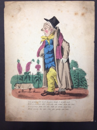
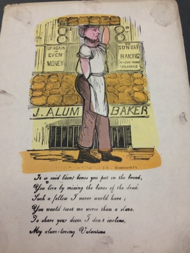
‘You gouty old fool, do you think I would wed, with a creature who scarcely can crawl from his bed?’

‘Then beast, don’t think I’d ever pine, to be an hypocrite’s Valentine’

Having the pleasure of opening one of these after pouring your heart into a Valentine’s card clearly wouldn’t be the happiest moment of your life but, thankfully, social etiquette has evolved slightly since then.

Finally, if you happen to receive one of these, do not blame us. On the flip side, if it has given you an idea, then Happy Valentine’s!

IMG_1271

Printing Plates

IMG_1291

When we think of printing, paper is often the material that comes to mind as the substrate of choice. Unsurprisingly, the semi-mystical Room 19 holds the key to lots of non-paper based printing; today’s example is crockery.

Tucked in between the Hyde Park’s Japanese Village posters and invitations to a Wayzgoose, it is possible to find a folder full of ceramic transfer tissues, which print the ‘Malvern’ design onto your crockery, even if we don’t know how St Bride acquired the items.

IMG_1289

The designs would have been printed onto the tissue paper via an engraved copper plate and would then be ready to print onto any dampened biscuitware (crockery fired once in a kiln). The tissue would be placed in the correct position, smoothed over with a wet sponge, and fired for a second time to remove the tissue paper. The final result might leave you feeling a bit colour blind; the ink was mixed with minerals so the colours would become more vivid after firing.

Transfer printing is still used in the ceramics industry, but the images are produced using modern technologies, including photographic processes, which were probably not available when the ‘Malvern’ pattern was introduced. Instead of using copper plates to produce the transfers, computers are used to create the artwork and then conventional printing processes to produce the finished item.

Large numbers of original copper plates, engraved for the decoration of crockery, still exist and could, potentially, be used to revive classic designs if there was a market for them. We do not hold any of the printing plates at St Bride, only a handful of transfer tissues.